Hi everyone! For my first articles I’ll be sharing my comic review checklist. It has three parts: everything that relates to the “flow” of the pages, everything that relates to the words on the pages, and then everything else. This is part one!
Although as a comics editor I don’t draw page layouts myself, I need to pay attention to how the comic pages read and flow together. Max Miller has already kicked off his blog post series on how to design comic pages, covering really important concepts like The Big Z, and when first putting pencil to paper I recommend finding resources that cover such techniques, even if only for inspiration. In his recent post Jason Brubaker mentioned Understanding Comics and Making Comics by Scott McCloud, and for me those two books were the most useful introductions to the comics medium ever. Now I insist all artists I work with read those books before starting any page layouts.
It’s easy to forget that reading comics is a learned skill and not something everyone is born knowing how to do, which is why page layouts are so important. The resources I mentioned above are great places to go for finding ways to experiment with creative layouts, but my checklist is for evaluating the creative decisions you’ve made after sketching them out. Will people be able to understand what you’ve drawn? Will most readers be able to tell in what order your panels and speech balloons should be read? In short, will your audience be able to make sense of your work without any guesswork?
With that introduction out of the way I now present, with lots of examples…
Jason Bane’s Comic Review Checklist, Part 1: Flow
- Do my eyes follow good lines when I read the comic, without too much zigzagging? Is the panel order at all confusing?
I’ve found that people who read comics on a regular basis don’t often pay attention to how they mentally process each page. They take in each page as naturally as if they were reading a book. But reading comics can sometimes be confusing for a novice because it may not immediately obvious in what order the panels should be read. When panels are arranged in regimented rows it’s pretty simple, but when the layouts get more free-form it gets tougher. When do you read to the right? When do you read down? When do you start over again at the next panel on the left?
For example, when I read this page spread of reMIND, it wasn’t immediately obvious to me which panel should be read 4th. It seemed like the the panel with Sonja first walking out of her bedroom should be read 4th because it’s both higher and to the right of panels 2 and 3, but I knew that wasn’t right because the bottom-left panel shows Sonja still in bed. Jason Brubaker used three great techniques here to help the reader understand that the “Sonja exiting bedroom” panel should be read 5th—a lighting change that separates it atmospherically from the first 4 panels, making the actual 4th panel overlap it, and making the panel span both pages in the spread—which together with story context helped me sort everything out. But I would venture to guess that a novice comic reader might need to work a little harder than me to assimilate this sequence of moments properly in their head.
Making each comic easy to follow is important for at least two reasons: Good layouts make it more comfortable for experienced readers who get annoyed when their reading rhythm is broken, and they help new readers who might be intimidated or put off by complex panel arrangements. There are a lot of subtleties in guiding a reader through a page in the proper order which I won’t cover here (and sometimes the order doesn’t matter or is left ambiguous on purpose), but my approach is simply to read through the rough layouts carefully while trying to sense where something could be confusing, keeping everything I’ve learned in mind.
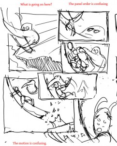
To give an example from my project, Anthony Cournoyer’s first layout plan for page 15 of Filter Dregs was tough to follow:
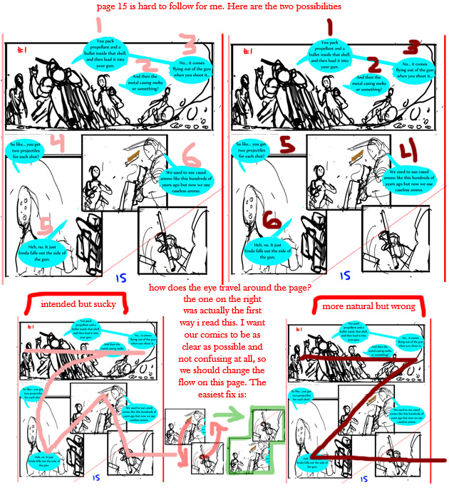
My reaction to the first proposed layout for page 15 of Filter Dregs.
It wasn’t obvious whether the center panel should be read second or third, and because the page needed to show a linear sequence of moments it made the whole thing confusing. I explained my confusion by drawing the “right” way to read it in pink, and the more natural but wrong way to read it in dark red. Anthony agreed and after a few revisions we decided on this layout, which was both mildly interesting and (I hope) completely clear.
- Does the layout get interesting when the story picks up? Are the right moments and actions emphasized effectively? Is the layout serving the story?
More exciting!
Less exciting…
This includes everything from the size, shape, and arrangement of panels on a page to how the contents of the panels are depicted. If something earth-shattering is revealed in a story, hopefully the story will pause for a beat or two to let the revelation sink in. Likewise, if a character is getting shot by a rocket, hopefully the page itself is as exciting as the action!
- Does the panel layout look pleasing and nice? Does anything seem off aesthetically?
This one is pretty subjective. This is in the checklist mostly to remind myself to take a step back and look at the pages for anything that bugs me (or sets off my OCD alarm). It’s like a comfort-check for me.
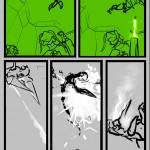
Example: I didn’t like how the speech balloon in Worst Case Scenario had panels on top of it, so I asked the artist (Daniel Allen) to rearrange his layers in Photoshop:
-
Bring the bubble to the fore!
- Does the action make sense as it is shown? Can I follow it clearly from panel to panel?
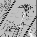
In other words, is the action consistent from panel to panel? Can I tell what is happening? This has to do with the contents of the panels, rather than the arrangement of the panels themselves. In the example below, Anthony’s first draft for page 15 of Jailing Fortune was just too confusing. He was brave enough to take some risks but this time they didn’t pay off, at least at first. It was hard to figure out in what order the panels should be read and worse than that, it was hard to follow the action even after I figured out the panel order:
Page 15: Confusion
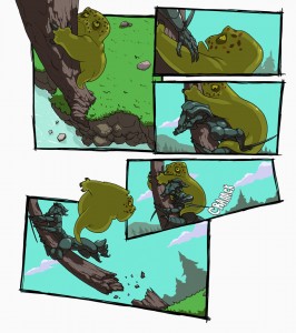
Page 15: Clarity
Scott McCloud’s panel-to-panel classification system would label this an “action-to-action” sequence. That means that when you read these panels, you understand that each panel is the next action or major change in the chain of events on the page, like dots in a connect-the-dots puzzle. In Anthony’s early draft it wasn’t clear how the actions flowed together. Too little happened between between panels 2 and 3, and too much between panels 4 and 5. Reorganizing the sequence to show one major action or change per panel transition (along with some panel rearranging) helped make this page easy to follow.
- Is the correct order of the speech balloons obvious, or is the order confusingly ambiguous?
Like the panel order, it’s always a good idea to make sure the speech balloons are arranged in way that makes their order easy to figure out. Understanding the ways people read speech balloons from left to right and top to bottom is super important, and you have plenty of great tools to lead readers through a conversation. Connecting speech balloons with tails, merging them together (think silhouette of a Venn diagram), allowing them to stick out of panels, having them overlap multiple panels, and even putting them completely in the gutters are all tricks you can use to adjust your conversations so they are easier to follow. Sometimes it takes some doing to arrange speech balloons in a way that makes the intended order clear.
-
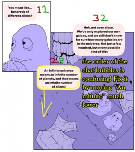
This speech balloon layout is misleading!
My example for this one is again from Filter Dregs. When Anthony was creating the speech balloons for page 2, he put the second panel’s final balloon in the lowest position but not low enough to make it clear that it should be read last. To make matters worse, placing a speech balloon from a given panel over the preceding panel is a cue to read that speech balloon first when moving into that panel. What resulted was the confusing situation you see on the left, which we remedied by lowering the second and third balloons, and connecting them with a tail. You can see what I mean by clicking here.
- Does the pacing feel right?
Making comics is, at the core, the art of creating time with space. The way the panels are arranged, the way the panels are divided, the way the characters are spaced, the way the speech balloons are positioned, really everything everything affects the pace at which a story is interpreted and experienced. Different people can experience the same layout in different ways but certain rules always apply. For example, more panels in a sequence means time moves slower, while fewer panels means time moves faster. Larger panels cause the reader to pause, while smaller panels are generally read more quickly. The more words on a page, the longer it takes to get through it. And so on.
-
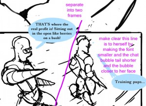
Rough sketch from page 9 from Hard Lessons
Personally, I pay the most attention to how the dialog comes across, which of course is only part of it. I want to make sure the beats in conversations are communicated well, because I consider the tempo and emphasis when I work on comic scripts and I don’t want to lose those considerations when the comic is drawn. In the example from Hard Lessons to the right, I asked Anthony to divide the panels because I wanted a pause between when the younger character finished his argument and when the older general reacted to it. I wanted to give the general’s muttering its own beat, or tick, or moment in time. To put it another way, I wanted to give her “face-palm” moment more weight. You can see the difference in how it turned out here.
- Do the panels that begin and end pages carry appropriate weight? Would rearranging the page divisions improve readability or “set the stage” better?
Carpe Chaos, like reMIND, presents its comics in digital books two pages at a time. That means I need to think about how the stories will be presented when they’re published on the site (and printed in books). Page divisions, either between two pages of the same spread or more importantly between page turnings, affect how the story is physically framed and what can be seen side-by-side. If you post your comic page by page, panel by panel, or some other way, your considerations will be different; you should be drawing your story to work well in your chosen format. But if you’re planning to print your comics someday, it might be a good idea to plan for how that might work too.
Adding a big dramatic moment or funny joke to the end of each page makes for great bite-sized updates, but if your goal is to tell a larger graphic-novel-style story, consider the reading experience when the story is complete. Reading a story where each page is strongly “punctuated” can disrupt the flow of the story and exhaust the reader. If you use your dramatic page-endings sparingly, they’ll hit the reader harder when you do choose to use them.
But you can’t ignore the page divisions, either. It’s generally a bad idea to split a sequence of moment-to-moment or action-to-action panels across multiple pages, because they read quickly and sometimes need to be next to one another to be clear. There’s also density to consider: sometimes not enough happens on a page, and sometimes a page is too cramped. The trick is to strike a balance, to keep it interesting without overdoing it. Unless you’re doing a crazy comic like Dr. McNinja or Axe Cop.
- Is it easy to become disoriented between panels as a result of camera angle changes? Is the 180° rule broken in ways that create confusion? Is a general orientation maintained throughout a scene, and if not, is that okay?
The 180°rule is more of a guideline, but the gist is if you rotate the camera (point of view) around a scene too much and the characters and objects swap places as a result of the changes, the comic (or motion picture for that matter) can become confusing. The way you can make sure not to do anything too disorienting is to draw an imaginary line through the middle point of a scene, and then draw all of the panels in that scene from the same side of that line, never moving the camera (point of view) across it. Of course you can break this rule without running into problems, but you have to pay attention to make sure you aren’t going to confuse the reader’s sense of left and right.
-
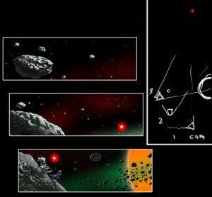
A quick diagram showing the 180° rule
Hopefully an example will help this make sense. On the first page of Moments of Elation, I wasn’t sure everything was in the same position because the point of view changed so much. Anthony drew a diagram for me to show he hadn’t broken the 180° rule, which you can see to the right, and that convinced me. But this story was a little special because it takes place in a zero-gravity environment and we wanted to create that zero-g feeling, which after all is inherently disorienting.
With a proper review of the overall flow of a page completed, the next considerations become words, speech balloon layouts, and typesetting, which I’ll cover in part 2.
__________________________
You can see more of Jason Bane’s work at carpechaos.com.
makingcomics.com
Nice. Liked the examples, it made it easier to see what he was talking about.
I wish more movie director’s would stick to the 180 degree rule. I have the hardest time watching action movies these days, it seams that they have no regard for letting the viewer feel anchored.
I look forward to the rest of this series.
me like ur stuff man