Posts Tagged: comics

15: Jim Zub – MakingComics.com Gutter Talk Podcast

The next time you think to yourself, “I am just way too busy,” please consider this podcast you’re about to listen to. How writer, artist, teacher, and literal jack of all trades Jim Zub even found the time to sit down for an hour with us is as mysterious as what the writers were thinking with the last season of LOST. At times it is a bit harrowing listening to Jim describe his day. Then you look at his amazing work, the result of stacking those seemingly endless days of creative output, and end up scooting your chair back in, grabbing a pencil, and sketching out your next idea or writing that last page or chapter.  Join Adam and Mark as they steal an hour from Jim Zub’s time to talk about… well, Jim Zub’s time.

(more…)

Self-Publishing Tips: Offset Printing, Part 2

Continued from part 1, which covered resolution, color space, page size and position.

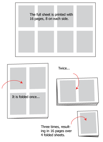
Number of pages:

While diversification of printing techniques means this is no longer always an issue, it remains an issue to be aware of when using offset printing. I am talking about the fact that the number of pages in a book needs to be a multiple of 16. This is due to the way offset printing, which makes use of large plates, works:

16p

(more…)

Easy Text Effects in Photoshop

This short video tutorial explains how to create quick, professional looking text sound effects using Photoshop. What’s more, the effect is non-destructive, meaning it uses layer styles on active text (not rasterized text) so you can change the word, change the look and even save it as a style to apply to other text. This is the way I do a majority of text effects on my comic Marooned.

(more…)

Hand Lettering A Digital Comic, Part 3

Once you have your lines of text set out, it’s time to launch into the final stage of lettering a page: composing your text on the page, and this is where I think hand-lettering shows a great advantage over font or mechanical lettering: flexibility.

(more…)

The Flow Of A Page, Part 2

Gutters and Borders: Where The Action Really Happens

So, here it is, the second installment in my series on ‘The Flow Of A Page.’  Last time we broke it down with panel layouts, both grid and free-form, and talked about ‘The Big Z,’ that is, bouncing the reader’s eye exactly where you want it to go across the page.  This is a medium that should strive for, above all other things, clarity.  You as the artist/writer/creator are trying to convey a message (story) that should be able to be digested by the reader without confusion or chaos.  That’s not to say confusion and chaos can’t be used as effective elements as well, but that’s for another post.  You’ve already learned some rudiments on panel layout, so now we will move on to the construction of panels, and that all-important space in between them, the gutter.

(more…)

13: Jason Brubaker & Daniel Lieske (Classic #1) – MakingComics.com Gutter Talk Podcast

Before there was Gutter Talk, and as crazy as it sounds there was life before Gutter Talk, Jason Brubaker released numerous podcasts of his own and published them on Making Comics (dotCom) 1.0. When the baton was passed to Patrick Yurick and the gang, there was some concern Jason’s podcasts would end up lost, never to be heard from again, like that one sock that gets eaten by the drier. Or something. Well, the intent to re-release these amazing conversations with even more amazing artists was there from the beginning of Making Comics (dotCom) 2.0. We just needed to grow into our ears a little bit and figure out how to walk. Now that we no longer seem to be having gravity issues, it just seemed like the right time to re-release Jason’s podcasts.

This is the first re-issue of many to come with Jason Brubaker. In this episode, Jason’s guest and sometimes co-host Daniel Lieske.

(more…)

Hand Lettering a Digital Comic, Part 2

With all your settings together, the process of lettering mainly becomes a matter of good form.  This applies as much to lettering with pen and paper as it does to the digital medium, but digital formatting amplifies the issues of good form because the feedback from a tablet and stylus is much different from what you get from pen and paper.  In short, the tablet produces the tendency for lines to wobble, because the pen can tend to slip.  This is particularly likely to happen if you aren’t using a properly controlled hand posture while you letter.  (See why I was so specific in the first part?)

(more…)

Self Publishing Tips: Offset Printing (Part 1)

Comic authors today benefit from increased choice in terms of how to publish. Digital publishing, i.e. webcomics, are the obvious and nearly-universal choice both for those who wish to print at some point an those who don’t intend to. Print-on-demand (PoD), similarly, makes it possible for everyone to make their work available as a book; and despite its many limitations it’s still much better than no possibility at all. Digital printing and various means offered by copy centers also present opportunities for enterprising artists to print small runs of books at a relatively modest cost, with more control over the final product than PoD allows. But the most exciting development, as far as I’m concerned, is that today sites like Kickstarter give everyone a chance to access good old offset printing, which this post is dedicated to. Here I’d like to discuss a number of things to know, to do, and to avoid in order to make the most out of offset printing, based on my personal training and experience printing comics and other books with various printers (with a lot of trial and error.)

Hand Lettering A Digital Comic, Part 1

The advent of cheap or free font packs, some designed specifically for comic books, has made it a lot easier for comic artists and cartoonists to letter their work in a clean, professional-looking manner. It may therefore seem strange to suggest applying old hand lettering principles to a digital art format. It’s not as odd an idea as it might seem, however, and has some significant advantages over font lettering. It’s also a lot easier than you might think.

(more…)

The Flow of a Page, Part 1

Breaking up the Page: Pencils And Rulers At The Ready

Is something not jiving right with the flow of your panels?  Welcome!  Here is the first in a series of articles enumerating tips and pitfalls to avoid when constructing an effective page layout.  You’re standing at the ground level; your layout is the first and most essential consideration when it comes to creating your compositions, so it shouldn’t be overlooked.  Crafting well-made pages is the initial step toward effectively transmitting your story to the reader: many battles are won and lost right here.

(more…)