Breaking up the Page: Pencils And Rulers At The Ready
Is something not jiving right with the flow of your panels? Welcome! Here is the first in a series of articles enumerating tips and pitfalls to avoid when constructing an effective page layout. You’re standing at the ground level; your layout is the first and most essential consideration when it comes to creating your compositions, so it shouldn’t be overlooked. Crafting well-made pages is the initial step toward effectively transmitting your story to the reader: many battles are won and lost right here.
So what is layout anyway? Just why is it important? Are there rules that dictate successful layouts? Well, just like anything else in the production of visual art, there are thousands of solutions, a myriad of ways to go about your specific task, but, there are guidelines that can help you find your way. This is an infinitely malleable medium. You, the creator, have complete control over this project, and it’s important to be aware of every decision you make when fashioning your tale. Your panel layout is the fundamental tool for storytelling, it’s the basket in which all your colorful characters and all your witty dialogue be carried across the page.
A successful layout is like good cinematography in a movie, it’s there to boost the mise-en-scène, to tie it together, but it doesn’t draw attention to itself. Everyone has experienced bad layout in a comic. When it happens you’re immediately taken out of the story. Whether it’s a dropped action, a strange focus that bounces you out the side of the page or a poor color pairing, the subtlest things can affect the flow of the comic, alternately fizzling the reader’s interest, or leading the reader in the right direction, that is, deeper into the story.
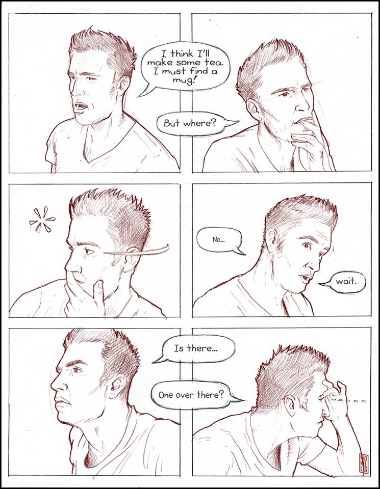
Pictured: The lack of focus, as well as omni-directional sightlines, can bounce a reader off the page.
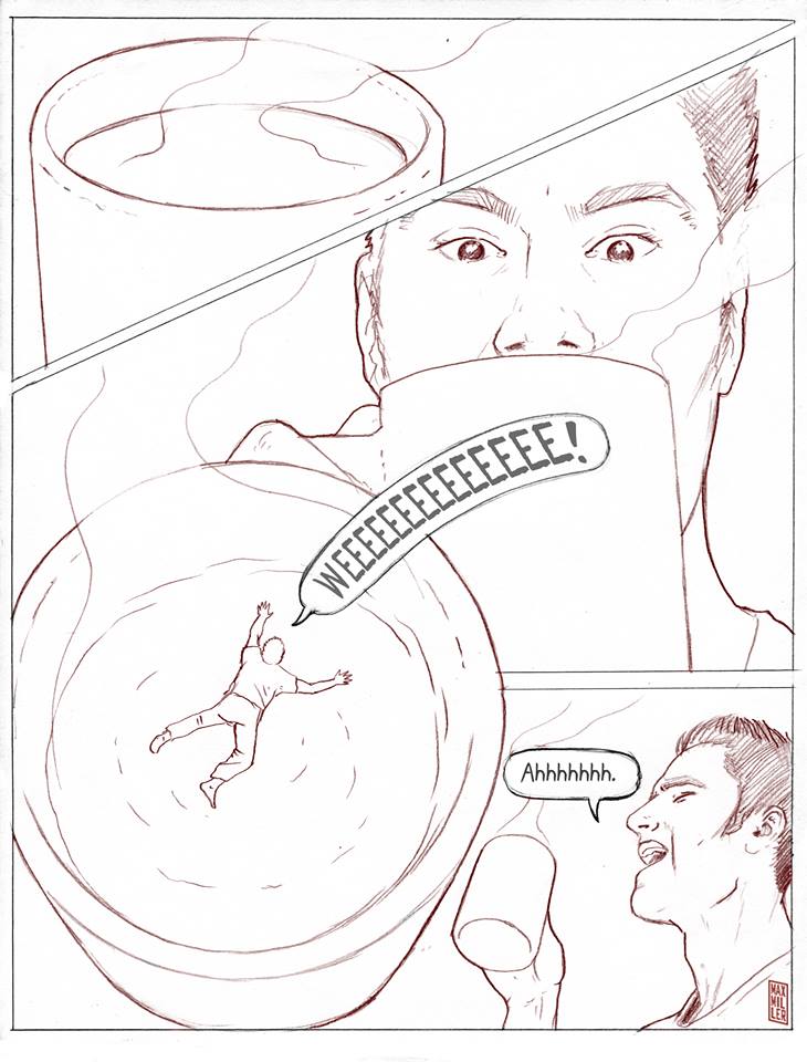
In this series of articles I’ll occasionally refer to what I call ‘The Big Z.’ The Big Z is a reference to how you typically want the reader’s eye to move over the page. In the West we read from left to right, top to bottom. When you stack panels on a page it results in the reader’s eye moving across the top panel from left to right and then bouncing down to the top left of the next panel, and so on.
Remember, these are only guidelines I’m putting down and there are always exceptions. Successful pages have been built in circular layouts, chaotic starbursts, or any other strange fashion, but they are usually the exception and they tend to draw attention to themselves. Both Alan Moore’s Swamp Thing and Neil Gaiman’s Sandman leap to mind as examples that successfully twist convention by shaking up the composition, and even forcing the reader to turn the comic in their hands from the horizontal to the vertical in order to follow the flow of the story. These are advanced techniques though. By and large the best way to keep someone in your story is to have them bouncing in a ‘Z’-like fashion down your page, as that’s what readers are already accustomed to. If you can keep someone comfortable, they’re more likely to stay in the story. Of course there are always reasons to create an anxious atmosphere by upending traditional layouts, but that will be covered in a later article.
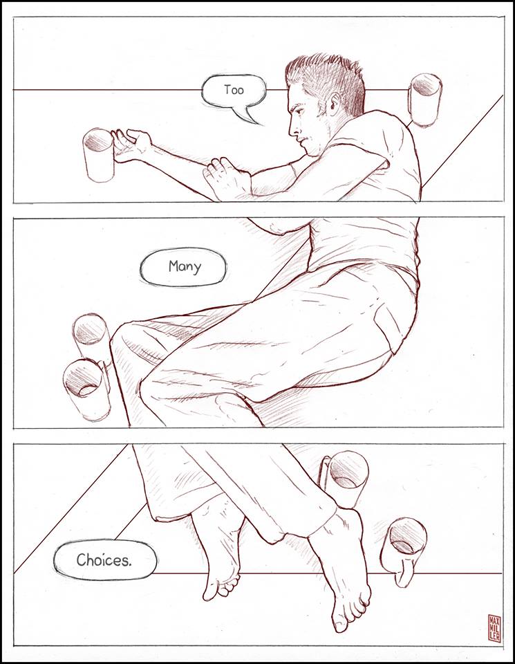
Pictured: Controlling the flow of the reader’s eye to what’s important.
To cut to the most basic structure in comics, we have the page. This is where all the action takes place, so to speak. With all this in mind, let’s jump into the rudiments of layout: Breaking up the page. Of course you can have a full page taken up by one panel. The classic hero shot is one of the mainstays in superhero comics. A companion to this is the two-page spread. You could build your comic solely on full, single panel pages, but it’s a sure-fire way to limit the dynamism that’s achieved by taking control of the panel vocabulary.
Full page and two-page splashes are best used when you want to draw a lot of attention to one specific moment in your story. Remember, these are sequences of static images. If you, the creator, are choosing to focus on one particular instant by throwing a full-page image into the mix, then there must be a good reason for it. One panel, one page, that’s about the simplest thing that can be thought of. So, what are some other simple panel layouts?
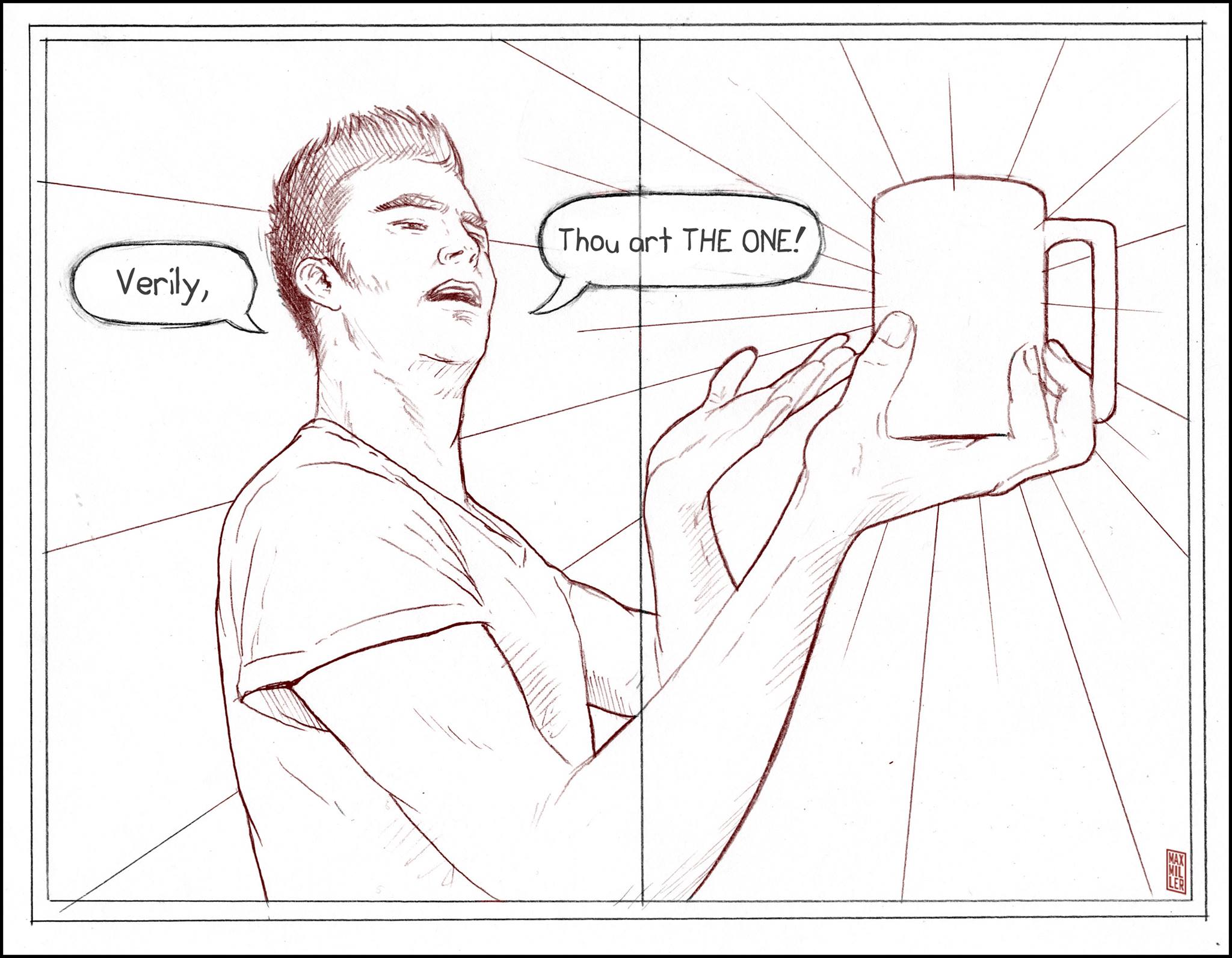
Pictured: A splash is best used to showcase a single, important instant.
The Grid: The grid is one of the most basic ways to partition a page. It can take many forms but at its most uncomplicated, you would divide the page into equal portions, say one line down the median vertical and one line on the median horizontal. Voilà! Four panels. You’ve just quadrupled your workspace. I know, it’s not very inspired, but it’s serviceable. You can take the grid in a lot of different directions, halving the space down infinitely in a comic form of Zeno’s Arrow if you choose, but at some point you’re going to be left with boxes that are too small to do anything with.
So how many panels are too many panels? It’s generally considered that keeping a page in the four to seven panel range is the best measure for making an effective composition. The more panels there are, the simpler the page needs to be. Again, this is not a hard rule, but a general guideline built on a hundred years of comic production. If you consistently have too many panels you run the risk of cluttering up your story, and you’ll be guilty of not giving the reader any space to breath.
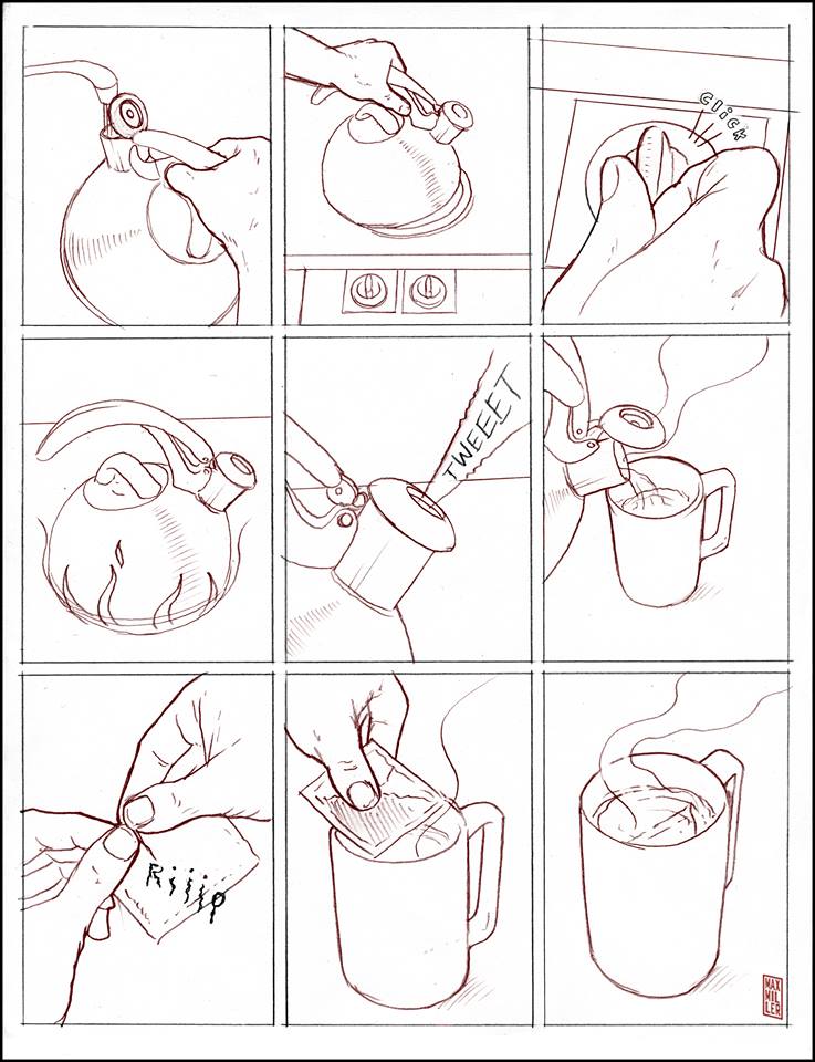
Pictured: A nine-panel grid housing distinct slices of life.
The grid is a good, serviceable tool, but its major drawback is that it can tend to feel very static. So unless you’re filling those regular boxes with very vibrant art or compelling dialogue, your reader may feel uninvolved when it comes to your story. This brings us to the other way to break up a page: the Freeform approach. Freeform is just what it says it is; it doesn’t adhere to any constraints. The artwork is free to break the panel barriers, leaking into adjacent panels, or the gutters dividing the panels may be absent altogether.
What the grid lacks in vigor, freeform has in spades. The trap to watch out for here is that it can be easy to go too wild with your composition. The main thing to remember is to always keep the ‘Z’ pattern within the page. That should be the skeleton of your flow, from which you’re always free to deviate.
Pictured: Freeform storytelling, a zippy route to the surreal.
There you have it, the beginner elements in layout construction. Join me next time when I’ll get into how gutters, bleeds and time can affect the flow of your story.
__________________________
See Max Miller’s comics at www.Artagem.com
makingcomics.com
Fantastic. I really liked this one. Layout is something I did instinctively at first, but the more I draw, the more I wonder if I know what the hell I am doing. Thanks for the clear, well illustrated break down. And I liked the comic too… I just sat down to drink my first cup (graveyard shift) so i was totally there with the hero. I am glad he won in the end.
Very good for beginners, especially the eyeflow part, something most beginners dont know.
Thanks so much for this helpful article!